
Table of Contents
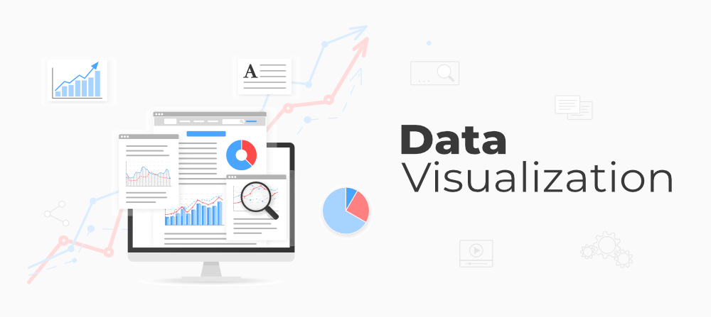
1. Introduction: The Power of Data Visualization in Marketing
Why Marketers Need Data Visualization
Data visualization has emerged as a vital tool in marketing in today’s digital world. With the massive explosion of data, the capacity to interpret and communicate insights quickly is critical. Data visualization transforms raw numbers into interesting pictures that simplify difficult information. Graphs, charts, and infographics will enable marketers to spot trends and patterns without having to sift through pages of information. Besides saving time, this ensures marketers make smart decisions that will ensure campaign success.
Increasing Role of Data in Marketing
Data plays an exponentially increasing role in marketing. Because customer behavior is changing daily, marketers have to depend on data to create experiences and effective strategies. Digital platforms produce humongous amounts of information, and hence the requirement for data visualization. Large sets of data may bring out information that marketers can apply for performance tracking, prediction, and even optimizing their efforts. Decisions today rely on data, leading to measurable outcomes instead of guesswork.
2. Top Data Visualization Tools for Marketers
Data Studio by Google: Free Powerhouse
It is free and essential to allow advertisers access to personalized reports and high levels of interaction. Data studio is also integrated with Google Analytics, Google Ads, as well as other data sources, which makes it one of the best choices for marketers looking for a low-cost solution. Google Data Studio lets you design dynamic dashboards that update in real-time, so you can keep an eye on the campaign performance at a glance. Because of its drag-and-drop interface, even newcomers could create very beautiful-looking content without facing a stiff learning curve. Two important features which make this product a necessity to marketers are real-time reporting and personalization.
A Closer Look at Interactive Dashboards with Tableau
Tableau is one of the most powerful data visualization platforms available for marketers who require more advanced functionality. It is known for making interactive dashboards. Using Tableau, a person can connect to multiple data sources and make sophisticated visualizations. Its ability to work with large datasets and real-time analytics makes it the marketer’s darling at enterprise level. Drill-down capabilities make Tableau an effective tool for marketers, enabling them to explore data at various levels of detail. While it takes a little more skill, the depth of discovery that can be done in Tableau is worth the marketing strategies that are data-driven.
Power BI: The Gap Between Data and Decision-Making
Microsoft’s Power BI is another great contender in the field of data visualization. This will enable marketers to create dynamic reports and real-time dashboards that are easy for teams to share. Marketers who already have an interest in Microsoft will appreciate Power BI’s seamless integration capabilities because it works well with other Microsoft products, such as Excel and Azure. Its interface is intuitive; its features, customizable: it’s great for user-defined visualizations tailored around specific marketing objectives. Something that really differentiates it is its capability to easily visualize complex data and its ability to enable data-based decisions.
Canva: Visuals Made Easy for Marketers
A must-have for marketers who require speedy and simple visualizations is Canva. As much as Canva is famous for graphic design, it also caters to various templates for data visualization. The marketers can easily produce infographics, charts, and reports in just a minute. Whether preparing a social media post, a blog graphic, or a marketing report, the simplicity comes with drag-and-drop features along with pre-designed templates. It is perfect for marketers that want to create great, visually appealing content without having the need for advanced design skills.
3. Tips for Effective Data Visualization
Successfully Recognize Your Audience
Be careful about the audience for your data visualization. All stakeholders have different needs. For example, a marketing team would require more information, whereas an executive might want a high-level summary with the most important conclusions. In this way, the graphics may be tailored for the audience, making them both relevant and actionable. It is your decision, how complex and how much information to put into the visual, based on whether your audience is familiar with the data or needs a summary.
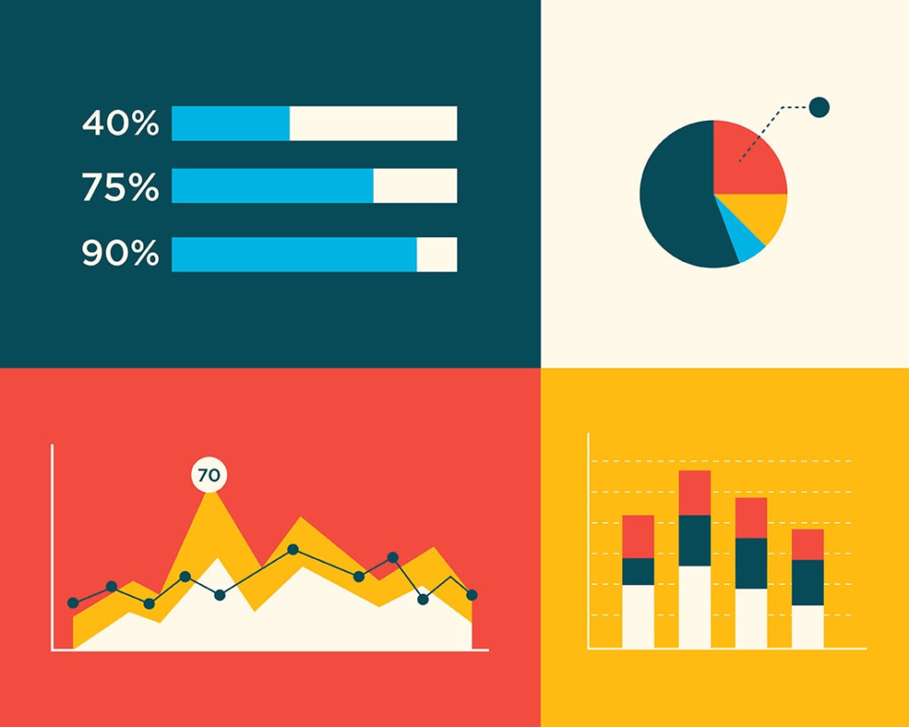
Choose the Right Type of Chart
The type of chart you choose can make or break the effectiveness of your data visualization. For example, it is good to use the bar chart for comparing and contrasting different categories. Using line charts to depict changes over time is a better idea. Pie charts are effective for proportions, but one should not use too many pieces in it. Heatmaps would be good for the density of data, and scatter plots would come in handy to depict correlations. Select the appropriate chart for your data so that your data will be shown in a very understandable and insightful way.
Keep it Simple and Clear
KISS. Avoid overloading your visuals with too many data points, colors, or elements. The purpose of creating data visualizations is to make the data easily understandable at a glance. Minimal designs and focus on key metrics that matter the most to your audience can help. A clean and clear visual ensures that your audience will quickly understand the data and make decisions based on the insights provided.
Use Color Wisely
Color is an element of data visualization. It is used to highlight important points, differentiate between categories, or represent trends in the data. However, there is a need to be wise with color. Do not use too many colors, as it makes the visualization overwhelming. Use a consistent color scheme that matches your brand and contrasting colors for emphasis on key insights. For example, color down tendencies red and upwards trends with green so your graphs are pleasing to the eyes and interpretative as well.
Narrate a Story in Your Data
A great data visualization doesn’t simply report the numbers; it tells a story. Imagine your data as a story, a story of a beginning, a middle, and an end. Start with a description of the problem or question that your data addresses, then walk your audience through insights and findings. You may annotate and label the data with explanations that can increase the relatability of data by adding context, and you can help your audience understand the importance of the data and how it influences their choices using a narrative.
4. How to Integrate Data Visualization into Your Marketing Strategy
Utilize Data to Inform Campaign Choices
This can be used in marketing when making data-driven decisions on actions. This is only possible if it is possible to visualize engagement levels, click-through rates, and conversion rates. Marketers are able to track the effectiveness of their campaign in real time by doing this. They are able to modify the campaign right away and improve its performance. It makes marketers nimble and responsive in each and every respect, to be responsive to new information and insight.
Use Visual Insights to Further Improve the Customer Experience.
Data visualization is a marketing tool that can help marketers in improving consumer satisfaction. Marketers can use this for the examination of consumer behavior and preferences, which leads to more individualized and focused ads. Data visualization, for instance, like segmentation charts and customer journey maps, helps marketers to better understand their target audience and produce interesting content. The more you know your customers, the better you can serve them, and therefore, enhance their delight and loyalty.
Track and Evaluate Marketing Results
The future of continuous improvement will be traced and measured based on marketing performance. Marketers can create real-time dashboards to display their key performance indicators using appropriate data visualization tools. A marketer can establish the effectiveness of his campaign and make any necessary changes using data regarding KPIs such as return on investment, client acquisition cost, and lifetime value. Data visualization provides the clarity needed in determining success and improving the tactics in the future.
FAQs
1. Which data visualization tools will be best for marketers in 2024?
The best data visualization tools for marketers in 2024 are:
- Google Data Studio: This is free and all-inclusive software, allowing marketers to create personalized, real-time reports and dashboards through seamless integration with Google Analytics, Google Ads, among others.
- Tableau: It is one of the advanced ones. It is apt for enterprise marketers because it deals with big data and gives interactive dashboards.
- The best one among the Microsoft tools which goes well with other products from the company is Power BI. Configurable reports, real-time dashboards, and advanced analytics are its advantages.
- Canva: It’s perfect for marketers who want to quickly get simple, visually appealing charts, infographics, and reports. This is achieved with the help of ready-to-use templates that can easily be customized.
- Looker: A newer tool that integrates nicely with other platforms and is very useful to marketers who are looking for in-depth analysis and insight.
2. What is the best graph to use for my visualization of data?
The type of data you are reporting and the story you want to tell will determine which graphic best:
- Bar graphs are great to show differences between numbers across categories.
- When presenting changes through a course of time, line graphs really work in showing patterns with selling, a website’s usage of analytics, for example.
- Using a few Pie Charts: Shows percentages or Proportion .
- When wanting to visualise patterns within huge Data sets, this would have to be, the Great Heatmaps .
- Scatter Plots: Excellent visual way when showing correlation in some relation from two variables.
The secret is to pick a chart that will help your audience understand and gain insight from the data.
3. Through data visualization, how does it help in improving the customer experience in marketing?
Data visualization improves customer experience through:
- Personalized campaigns: Data visualization helps track customer behavior and preferences while allowing marketers to make targeted campaign efforts that connect with distinct groups of customers.
- Customer journey tracking: The journey maps of customers can help marketers know what is happening around the brand as the customers connect with it at all possible touchpoints. This also leads to smooth, personalized experiences.
- Real-time Feedback: Since data visualization allows marketers to track consumer activities in real time, campaigns or content can be changed as quickly as possible to increase satisfaction among customers.
4. How can I use data visualization to engage my audience?
To make data visualization engaging
- Keep it simple: Never make the information clutter an item of visualization. Instead focus only on a key insight and leave the other information easily accessible to read and understand.
- Apply Interactive Dashboards: When one utilizes tools like Tableau or Power BI, then users can explore in any desired manner, clicking their way into answers.
- Tell a Story: Place your data in context by telling a story. Start with the problem or question and then take your audience through the insights, demonstrating how the data has an answer to the question.
- Add Branding: Use all the colors, fonts, and design elements to make it look cohesive and professional-looking.
5. Mistakes Marketers Make When Using Data Visualization
Making the visuals too complicated
- Overusing too many colors, charts, and other data points may kill your audience. Keep to only the essentials and keep it clean and simple.
- Selecting Wrong Chart Type: A pie chart would do very well if there were three to four categories, but five categories on it and a bar chart where a trend needs to be indicated to a person will confuse him or her. Always pick that chart that best represents your data.
- Not Accounting for Your Audience: Not catering for the knowledge level of your audience. The executive might need high-level insight whereas the marketing team needs detailed data.
- Lack of Context: Without any context, data can be difficult for the audience to understand its significance. Always use labels, annotations, and brief explanations.
6. How can data visualization optimize marketing campaigns?
Data visualization can optimize marketing campaigns in the following ways:
- Real-Time Monitoring: Through conversion rates, CTR, and other engagement levels, campaign performance is visualized and monitored in real time to ensure that appropriate data-driven decisions are made promptly.
- Find Trends: This visualization of trends over time allows marketing professionals to spot trends and predict future performance. For example, line charts could depict the ups and downs of a campaign to enable marketers to change their approach before it’s too late.
- Results of A/B Testing: Visualization of A/B test results makes comparing the different versions of the same campaign much easier while making decisions about which one will be better.
7. What are some tips for creating data visualizations that are mobile-friendly?
When making mobile-friendly data visualizations:
- Simplify: Focus on the most important information as screens are smaller. Avoid clutter and keep it concise.
- Optimize for Touch: Ensure that elements to be interacted with are easy to tap on. Large buttons and well-defined areas of interaction will make for a better user experience.
- Make sure your visualizations are responsive so they can work with the size of the screens. You could make interactive dashboards through Google Data Studio and Power BI for smooth presentations on handheld devices.
Use Scalable Fonts and Icons: The icons should be large enough to touch easily while the texts should still be readable with small-screen displays.
8. What are the possibilities of having data visualization helping marketers in regards to return on investment?
With the help of data visualization, marketers can also increase the ROI by
- Monitoring KPIs : Marketers may be able to see if their efforts are paying off or where adjustments need to be made through visual monitoring of key performance indicators like acquisition cost per client, conversion rates, and lifetime value.
- Optimizing Ad Spend: Visualizing ad performance data will enable marketers to quickly spot which ads are performing well and reallocate budgets accordingly to high-performing campaigns.
- Customer Segmentation: Data visualization could provide market people the scope of high-profit customer groups or groups on which they would work further to maximize customer lifetime value.
9. What is the impact of colours for data visualization for marketers?
A tremendous role of colors in enriching data visualization for marketers,
- Important Points Color is a medium through which important information of a trend or anomaly attracts users’ attention.
- Indicating Positive/Negative Trends: Red can represent a negative trend (e.g., sales are declining), and green can be used to represent a positive trend (e.g., the number of conversions is increasing).
- Creating Visual Hierarchy: Various colors can be used to distinguish between categories or variables, making it easier for the audience to navigate complex data.
10. How do marketers make sure that everyone can see their data visualizations?
To ensure that the visualizations are accessible:
- Use High Contrast: Ensure that the background color and text contrast enough for visually impaired people to read the images.
- Provide Descriptive Labels: Provide alt text for charts and other graphics so that screen readers can describe them to users who are blind or have low vision.
- Avoid Color Overuse: Use patterns or textures besides color to ensure that the information remains readable for colorblind users.
Conclusion
The luxury of data visualization is behind the present-day marketer who relies heavily on such information to make a valid decision in an impactful manner. This is where raw data transforms into clear, compelling visuals that reveal actionable insights into driving strategy, optimally running campaigns, and perfecting customer experiences. While using Google Data Studio, Tableau, Canva, or other tools is an important step, ensuring the right platform is the choice that fits your aims and expertise.
It simplifies complex data and also allows marketers to track performance, identify trends, and adjust in real time. When best practices are followed in terms of knowing the audience, chart types are appropriate, and visuals are kept clean and simple, marketer visuals are both engaging and insightful.
Plus, integrating data visualization into your marketing strategy can significantly improve your ROI by improving the effectiveness of your decision-making processes, personalizing campaigns, and providing deeper insights into consumer behavior. Data visualization is a powerful tool for communicating facts that are truly important, whether your goal is to improve customer experience, track campaign performance, or get better outcomes.
To stay ahead of the curve, embracing the power of data visualization is essential as marketing continues to evolve. With these tools and advice, marketers can truly revolutionize their approach to data-driven marketing, ensuring efficacy, targeting, and outcome-oriented tactics for sustained success.